SciPy is a community (scipy.org). ScyPy stack contains: NumPy, Python, Matplotlib, Sympy, IPython, and Pandas.
We would now use SciPy packages to do some statistical computing. We would discuss the concepts of mean, median, mode, quartiles etc. in a separate post. We would consider that in this post that we have the knowledge of those basic statistical concepts, and see how we can use SciPy/NumPy to compute those values for a data set.
We would first import the New York weather data that we downloaded in earlier post, as shown below.
import numpy as np
dt = np.dtype([('Month', 'int8'), ('Day', 'int8'), ('Year', 'int16'), ('Temp', 'float64')])
data = np.loadtxt('weather/NYNEWYOR.txt', dtype=dt)
print data[:5]
and find the total number of records in the data, and also create an array "year2012" to extract and store the year 2012 NY weather data set into that array as shown below:
total_days = len(data)
print total_days
year2012 = data[data['Year'] == 2012]
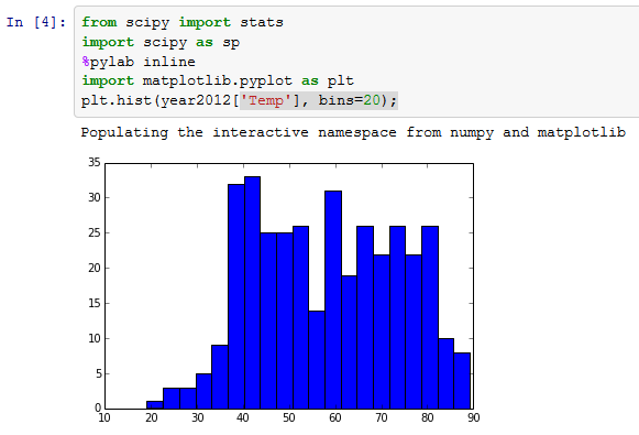
 Now we will plot the year 2012 data in a histogram, as below:
from scipy import stats
import scipy as sp
%pylab inline
import matplotlib.pyplot as plt
plt.hist(year2012['Temp'], bins=20);
Now we would define a NumPy function as below, which would calculate the number of data points, min/max of the data, variance, kurtosis, and median of data, using def as shown below.
def describe_data(x):
n, min_max, mean, var, skew, kurt=sp.stats.describe(x)
print 'number of points: ', n
print 'min/max: ', min_max
print 'mean: ', mean
print 'variance: ', var
print 'skew: ', skew
print 'kurtosis: ', kurt
print 'median: ', sp.median(x)
We would now call the function on the 2102 data set using:
describe_data(year2012['Temp'])

Scipy provides somewhat powerful mquantiles function. mquantiles allows to quickly divide our data into 4 quartiles by requesting points at 0.25, 0.5, 0.75, and 1.0.
sp.stats.mstats.mquantiles(year2012['Temp'], [0.25, 0.5, 0.75, 1.0])
That 0.25 number will correspond to the first value that is greater than the 25% of the data entries. Similarly, we expect .5 to be the median, .75 to be greater than 75% of the entries, and 1 to be responsible for the greatest entry. We can put any number we want in there in mquantiles, between 0-1, for example, if we are interested in temp that are hotter than 90% of all the other days, as well as the 95%, and 100% of the entries, we could request that as well using:
sp.stats.mstats.mquantiles(year2012['Temp'], [0.90, 0.95, 1.0])
Fit and Interpolate Data
Now we would be fitting data and interpolating it using the statistical package in ScyPy.
%pylab inline
import matplotlib.pyplot as plt
import numpy as np
import scipy.stats as stats
Now let’s seed the NumPy random number generator with the value, 1. Then we are going to take 150 random samples, centered at 25, with a standard deviation of 1.
np.random.seed(1)
rnd = stats.norm.rvs(loc=25, scale=1, size=150)
Let’s go ahead and plot this sample.
plt.hist(rnd)
 Now let’s see how to estimate a probability distribution function from the data that we have just sampled.
To calculate the mean and standard deviation in SciPy:
param = stats.norm.fit(rnd)
print “mean: “, param[0], “stddev: “, param[1]
Now let’s see how to fit the data compared to original samples. Here, we are going to draw 100 points, from the fitted density function.
x = np.linspace(20, 30, 100)
pdf_fitted = stats.norm.pdf(x, loc=param[0], scale=param[1])
Now, we are going to plot a normalized histogram against the probability distribution function that we just fitted.
plt.title('Normal Distribution')
plt.plot(x, pdf_fitted, 'r-')
plt.hist(rnd, bins=20, normed=1, alpha=0.3);
 Now we are going to use slightly advanced analytics techniques on our weather data. The common way to estimate a unknown probability density function (pdf) from a collection of samples of random variables, like Temperature in our weather data, is to use the Gaussian KDE, where KDE stands for kernel density estimation. Let’s go ahead and run two fits, one against all of the 18 yrs of temperature data from NY City, and another for the 2012 data. Then we will plot both pdfs against the 2012 temperature data.
pdf_all = stats.gaussian_kde(data['Temp'])
year2012 = data[data['Year'] == 2012]
year2012t = year2012['Temp']
pdf_2012 = stats.gaussian_kde(year2012t)
We collect a sample of points between the temp values 10 and 100 and plot the pdfs over those points.
x = np.arange(10, 100)
plt.plot(x, pdf_all(x), x, pdf_2012(x));
plt.legend(['all data', '2012 data'])
plt.hist(year2012t, normed=True, alpha=0.3);

As we can see, the data still looks bi-modal.
One more thing that we can do is to analyze all of the weather station data, across all 18 yrs, and see if it looks a little bit more like a Gaussian.
We will import os.path and the glob module. “glob” module allows us to query a large number of files on the file system using the standard wildcard (*) syntax.
import os.path
import glob
files = glob.glob('weather/*.txt')
names = [os.path.splitext(
os.path.basename(file))[0]
for file in files]
print files
Now we would grab all of these temp data from all these weather stations, and put them in one big array. We will have to do this dynamically though. First, we would load each of these data sets independently, and append them into a list, called total_temps.
dt = np.dtype([('Month', 'int8'),
('Day', 'int8'),
('Year', 'int16'),
('Temp', 'float64')])
total_temps = []
files = glob.glob('weather/*.txt')
for f in files:
t_data = np.loadtxt(f, dtype=dt)
total_temps.append(t_data['Temp'])

After we created that list, we will call NumPy vstack function. vstack allows us to stack the total temp arrays side-by-side. This works as they all have the same total length. After we call flatten(), we will expect a big long array, just in one dimension.
total_temps = np.vstack(total_temps).flatten()
print total_temps.shape
Let’s try to fit and then plot the Gaussian KDE against that data.
pdf = stats.gaussian_kde(total_temps)
x = np.arange(20, 100)
plt.hist(total_temps, bins = 20, normed = True)
plt.plot(x, pdf(x), 'r-');
 Now, let’s try to fit a normal Gaussian though this distribution. So we call the norm.fit method, which outcomes a mean and a standard deviation. Then we can create a probability density function from the mean and the standard deviation calculated just now. We plot this against our histogram of data as:
mean, stddev = stats.norm.fit(total_temps)
pdf = stats.norm.pdf(x, loc=mean, scale=stddev)
plt.hist(total_temps, bins=20, normed=True)
plt.plot(x, pdf);
We can see that the function is not a good fit, as those -99 values are causing a problem. Let’s see what happens when we get rid of them.
First, let’s use the describe_data function that we have defined earlier.
describe_data(total_temps)
If we are looking at a regular Gaussian distribution, we won’t expect these values for kurtosis and skew to be so high.
 Here is a straightforward method to remove those problematic -99 values from our data. We save it into a new variable called fixed_temps and let’s look at the describe_data function on the new values.
fixed_temps = total_temps[total_temps != -99]
describe_data(fixed_temps)
Now the skew and kurtosis are sharply removed.

Now let’s see how the fixed fit compares against our original fit.
x = np.arange(10, 100)
mean, stddev = stats.norm.fit(total_temps)
pdf = stats.norm.pdf(x, loc=mean, scale=stddev)
plt.hist(total_temps, bins=20, normed=True)
plt.plot(x, pdf);
mean1, stddev1 = stats.norm.fit(fixed_temps)
fixed_pdf = stats.norm.pdf(x, loc=mean1, scale=stddev1)
plt.hist(total_temps, bins=20, normed=True)
plt.plot(x, pdf, x, fixed_pdf);

But as we have deleted the data, we have missing data in our data set, and with this, we have misaligned our data with the original data set that we had. Let’s talk about how to fix this using interpolation.
First, let’s do a simple interpolation example. Let’s take a look at a coarsely sampled smooth function, cosine^2. We will do both linear and cubic interpolations. The interpolation f below is the linear one, and the f2 one is the cubic interpolator.
from scipy.interpolate import interp1d
x = np.linspace (0, 10, 10)
y = np.cos(-x**2/8.0)
f = interp1d(x, y)
f2 = interp1d(x, y, kind='cubic')
Now we will re-sample the data at a finer resolution. We will plot the original data points, the higher resolution cosine^2, and then our 2 interpolators.
xnew = np.linspace(0, 10, 40)
plt.plot(x, y, 'x',
xnew, np.cos(-xnew**2/8.0), '-',
xnew, f(xnew), '-',
xnew, f2(xnew), '-')
plt.legend(['data', 'actual', 'linear', 'cubic'], loc='best')
plt.show()
 We can see the original data in blue x points, and the linear interpolator would draw direct lines between them, the cubic interpolator on the other hand would try to smoothly fit, assuming that the derivative is slowly changing. We see that this was a much better job of fitting the cosine function until we do not have enough data to assess where the curve is going. We need to choose an interpolator that matches our underlying function. If we expect our data to be not very smooth, we are better of using a linear interpolator. On the other hand, if our data is smoothly varying, we may consider using a higher order interpolator, although those are computationally more expensive.
So let’s get back to our original data. Here, we are reloading the NY data using the same dtype as we were using before. We will be grabbing two different indices, one for the values that are correct, and another where we have missing data. We use na_* here to stand for missing data.
dt = np.dtype([('Month', 'int8'), ('Day', 'int8'), ('Year', 'int16'), ('Temp', 'float64')])
data = np.loadtxt('weather/NYNEWYOR.txt', dtype=dt)
v_idxs = np.where(data['Temp'] != -99)
print v_idxs[0].size
na_idxs = np.where(data['Temp'] == -99)
print na_idxs[0].size
So we have 6729 valid entries, and 20 missing entries. Let’s take a closer look at some of those missing entries.
data[['Day', 'Temp']][514:523]
If we delete those missing indices,
for na in na_idxs:
data = np.delete(data, na, 0)
So if we see the data set again, we would see that those missing data sets are not available in our data anymore.
data[514:523][[ 'Day', 'Temp']]
 Now if we want to bring that data back to our data set, we need to use linear interpolation, as below:
We take our modified data set, where we have deleted all the missing entries, and we build an interpolator over that.
x = v_idxs[0]
linterp = interp1d(x, data['Temp'], kind='linear')
Then we will reload the data, plot it, bad entries and all, and then use our new interpolator to show how to fix those holes.
original_data = np.loadtxt('weather/NYNEWYOR.txt', dtype=dt)
total_days = len(original_data)
plt.plot(original_data['Temp'][510:530])
xnew = np.arange(total_days)
plt.plot(linterp(xnew)[510:530]);
 Here we can see that the original data (in blue) dividing down to -99, every time we are missing an entry. Using the interpolator though, we are smoothly interpolating between missing dates, providing continuous data set, which is easier to use for correct analysis.
Understand sci-kit learn
SciPy covers many of the canonical scientific computing applications. However, recent developments in statistical computing and data mining has spawned a new field, called Machine Learning. Scikit Learn is largely considered as a standard ML package for Python. Like many numerical computing packages, Scikit Learn leverages NumPy’s architecture and memory model under the hood.
At a high level, we can separate ML in 2 separate categories, Supervised Learning and Unsupervised Learning. Though there is a gradient between these two extremes, and many techniques leverage semi-supervised learning techniques. Generally, we speak of supervised learning when we are referencing algorithms where the data comes pre-labeled, that is these samples are good, these samples are bad, or these samples are category 1, 2, or so on. Often, Supervised Learning is useful for predicting the category or class, a new sample should belong to. Unsupervised learning defines a collection of algorithm where the data is not labeled. Often there are relationships between data and we want to infer or predict those relationships.
You can refer to Andreas Mueller’s cheat sheet for Scikit Learn at:
http://peekaboo-vision.blogspot.com/2013/01/machine-learning-cheat-sheet-for-scikit.html
where he mentions about 4 main techniques in ML.
 Classification: When we are trying to categorize labeled data (e.g., detecting spam in email, determining what digit has been handwritten, or detecting if the signature has been forged)
Clustering: Clustering is when we are trying to categorize the unlabelled data (e.g., determining the categories for movies, or classifying our customers or clients, or trying to find patterns in natural phenomena or processes)
Regression: We use regression when we are trying to estimate or predict a response, usually from a continuous distribution. (e.g., weather forecasting,
Dimensionality Reduction: It can be further subdivided into Feature Selection, and Feature Extraction. Both techniques try to reduce the # of variables under consideration. In Feature selection, we try to identify the subset of variables that are most important for our data. In Feature Extraction, we try transform into a space with a fewer dimensions using techniques such as Principal Component Analysis.
In all of these techniques in Scikit Learn, there is a fit stage and a predict stage. First we try to build the classifier from the training data, and then we predict against the test data.
Let’s look at a quick example from the Scikit Learn tutorial.
%pylab inline
import matplotlib.pyplot as plt
from sklearn import datasets
Then we get the digits data set from Scikit Learn. The digits data set contains a series of digits, scanned at a low resolution.
digits = datasets.load_digits()
plt.imshow(digits.images[-1],
cmap=plt.cm.gray_r,
interpolation='nearest')
Here, we have a very vague outline of an A. The associated target array contains that information.
digits.target[-1]
 Now, we are going to build a simple support vector classifier.
from sklearn import svm
In the first part, we fit it to the data. We exclude the final piece of data, because we are going to use that for a task.
clf = svm.SVC(gamma=0.001, C=100.)
clf.fit(digits.data[:-1], digits.target[:-1])
After the classifier has been built, we can use it for prediction.
clf.predict(digits.data[-1])
As you can see, the classifier arrived at the same digit A.

We would now use SciPy packages to do some statistical computing. We would discuss the concepts of mean, median, mode, quartiles etc. in a separate post. We would consider that in this post that we have the knowledge of those basic statistical concepts, and see how we can use SciPy/NumPy to compute those values for a data set.
We would first import the New York weather data that we downloaded in earlier post, as shown below.
import numpy as np
dt = np.dtype([('Month', 'int8'), ('Day', 'int8'), ('Year', 'int16'), ('Temp', 'float64')])
data = np.loadtxt('weather/NYNEWYOR.txt', dtype=dt)
print data[:5]
and find the total number of records in the data, and also create an array "year2012" to extract and store the year 2012 NY weather data set into that array as shown below:
total_days = len(data)
print total_days
year2012 = data[data['Year'] == 2012]
from scipy import stats
import scipy as sp
%pylab inline
import matplotlib.pyplot as plt
plt.hist(year2012['Temp'], bins=20);
Now we would define a NumPy function as below, which would calculate the number of data points, min/max of the data, variance, kurtosis, and median of data, using def as shown below.
def describe_data(x):
n, min_max, mean, var, skew, kurt=sp.stats.describe(x)
print 'number of points: ', n
print 'min/max: ', min_max
print 'mean: ', mean
print 'variance: ', var
print 'skew: ', skew
print 'kurtosis: ', kurt
print 'median: ', sp.median(x)
We would now call the function on the 2102 data set using:
describe_data(year2012['Temp'])
Scipy provides somewhat powerful mquantiles function. mquantiles allows to quickly divide our data into 4 quartiles by requesting points at 0.25, 0.5, 0.75, and 1.0.
sp.stats.mstats.mquantiles(year2012['Temp'], [0.25, 0.5, 0.75, 1.0])
That 0.25 number will correspond to the first value that is greater than the 25% of the data entries. Similarly, we expect .5 to be the median, .75 to be greater than 75% of the entries, and 1 to be responsible for the greatest entry. We can put any number we want in there in mquantiles, between 0-1, for example, if we are interested in temp that are hotter than 90% of all the other days, as well as the 95%, and 100% of the entries, we could request that as well using:
sp.stats.mstats.mquantiles(year2012['Temp'], [0.90, 0.95, 1.0])
Fit and Interpolate Data
Now we would be fitting data and interpolating it using the statistical package in ScyPy.
%pylab inline
import matplotlib.pyplot as plt
import numpy as np
import scipy.stats as stats
Now let’s seed the NumPy random number generator with the value, 1. Then we are going to take 150 random samples, centered at 25, with a standard deviation of 1.
np.random.seed(1)
rnd = stats.norm.rvs(loc=25, scale=1, size=150)
Let’s go ahead and plot this sample.
plt.hist(rnd)
To calculate the mean and standard deviation in SciPy:
param = stats.norm.fit(rnd)
print “mean: “, param[0], “stddev: “, param[1]
Now let’s see how to fit the data compared to original samples. Here, we are going to draw 100 points, from the fitted density function.
x = np.linspace(20, 30, 100)
pdf_fitted = stats.norm.pdf(x, loc=param[0], scale=param[1])
Now, we are going to plot a normalized histogram against the probability distribution function that we just fitted.
plt.title('Normal Distribution')
plt.plot(x, pdf_fitted, 'r-')
plt.hist(rnd, bins=20, normed=1, alpha=0.3);
pdf_all = stats.gaussian_kde(data['Temp'])
year2012 = data[data['Year'] == 2012]
year2012t = year2012['Temp']
pdf_2012 = stats.gaussian_kde(year2012t)
We collect a sample of points between the temp values 10 and 100 and plot the pdfs over those points.
x = np.arange(10, 100)
plt.plot(x, pdf_all(x), x, pdf_2012(x));
plt.legend(['all data', '2012 data'])
plt.hist(year2012t, normed=True, alpha=0.3);
As we can see, the data still looks bi-modal.
One more thing that we can do is to analyze all of the weather station data, across all 18 yrs, and see if it looks a little bit more like a Gaussian.
We will import os.path and the glob module. “glob” module allows us to query a large number of files on the file system using the standard wildcard (*) syntax.
import os.path
import glob
files = glob.glob('weather/*.txt')
names = [os.path.splitext(
os.path.basename(file))[0]
for file in files]
print files
Now we would grab all of these temp data from all these weather stations, and put them in one big array. We will have to do this dynamically though. First, we would load each of these data sets independently, and append them into a list, called total_temps.
dt = np.dtype([('Month', 'int8'),
('Day', 'int8'),
('Year', 'int16'),
('Temp', 'float64')])
total_temps = []
files = glob.glob('weather/*.txt')
for f in files:
t_data = np.loadtxt(f, dtype=dt)
total_temps.append(t_data['Temp'])
After we created that list, we will call NumPy vstack function. vstack allows us to stack the total temp arrays side-by-side. This works as they all have the same total length. After we call flatten(), we will expect a big long array, just in one dimension.
total_temps = np.vstack(total_temps).flatten()
print total_temps.shape
Let’s try to fit and then plot the Gaussian KDE against that data.
pdf = stats.gaussian_kde(total_temps)
x = np.arange(20, 100)
plt.hist(total_temps, bins = 20, normed = True)
plt.plot(x, pdf(x), 'r-');
mean, stddev = stats.norm.fit(total_temps)
pdf = stats.norm.pdf(x, loc=mean, scale=stddev)
plt.hist(total_temps, bins=20, normed=True)
plt.plot(x, pdf);
We can see that the function is not a good fit, as those -99 values are causing a problem. Let’s see what happens when we get rid of them.
First, let’s use the describe_data function that we have defined earlier.
describe_data(total_temps)
If we are looking at a regular Gaussian distribution, we won’t expect these values for kurtosis and skew to be so high.
fixed_temps = total_temps[total_temps != -99]
describe_data(fixed_temps)
Now the skew and kurtosis are sharply removed.
Now let’s see how the fixed fit compares against our original fit.
x = np.arange(10, 100)
mean, stddev = stats.norm.fit(total_temps)
pdf = stats.norm.pdf(x, loc=mean, scale=stddev)
plt.hist(total_temps, bins=20, normed=True)
plt.plot(x, pdf);
mean1, stddev1 = stats.norm.fit(fixed_temps)
fixed_pdf = stats.norm.pdf(x, loc=mean1, scale=stddev1)
plt.hist(total_temps, bins=20, normed=True)
plt.plot(x, pdf, x, fixed_pdf);
But as we have deleted the data, we have missing data in our data set, and with this, we have misaligned our data with the original data set that we had. Let’s talk about how to fix this using interpolation.
First, let’s do a simple interpolation example. Let’s take a look at a coarsely sampled smooth function, cosine^2. We will do both linear and cubic interpolations. The interpolation f below is the linear one, and the f2 one is the cubic interpolator.
from scipy.interpolate import interp1d
x = np.linspace (0, 10, 10)
y = np.cos(-x**2/8.0)
f = interp1d(x, y)
f2 = interp1d(x, y, kind='cubic')
Now we will re-sample the data at a finer resolution. We will plot the original data points, the higher resolution cosine^2, and then our 2 interpolators.
xnew = np.linspace(0, 10, 40)
plt.plot(x, y, 'x',
xnew, np.cos(-xnew**2/8.0), '-',
xnew, f(xnew), '-',
xnew, f2(xnew), '-')
plt.legend(['data', 'actual', 'linear', 'cubic'], loc='best')
plt.show()
So let’s get back to our original data. Here, we are reloading the NY data using the same dtype as we were using before. We will be grabbing two different indices, one for the values that are correct, and another where we have missing data. We use na_* here to stand for missing data.
dt = np.dtype([('Month', 'int8'), ('Day', 'int8'), ('Year', 'int16'), ('Temp', 'float64')])
data = np.loadtxt('weather/NYNEWYOR.txt', dtype=dt)
v_idxs = np.where(data['Temp'] != -99)
print v_idxs[0].size
na_idxs = np.where(data['Temp'] == -99)
print na_idxs[0].size
So we have 6729 valid entries, and 20 missing entries. Let’s take a closer look at some of those missing entries.
data[['Day', 'Temp']][514:523]
If we delete those missing indices,
for na in na_idxs:
data = np.delete(data, na, 0)
So if we see the data set again, we would see that those missing data sets are not available in our data anymore.
data[514:523][[ 'Day', 'Temp']]
We take our modified data set, where we have deleted all the missing entries, and we build an interpolator over that.
x = v_idxs[0]
linterp = interp1d(x, data['Temp'], kind='linear')
Then we will reload the data, plot it, bad entries and all, and then use our new interpolator to show how to fix those holes.
original_data = np.loadtxt('weather/NYNEWYOR.txt', dtype=dt)
total_days = len(original_data)
plt.plot(original_data['Temp'][510:530])
xnew = np.arange(total_days)
plt.plot(linterp(xnew)[510:530]);
Understand sci-kit learn
SciPy covers many of the canonical scientific computing applications. However, recent developments in statistical computing and data mining has spawned a new field, called Machine Learning. Scikit Learn is largely considered as a standard ML package for Python. Like many numerical computing packages, Scikit Learn leverages NumPy’s architecture and memory model under the hood.
At a high level, we can separate ML in 2 separate categories, Supervised Learning and Unsupervised Learning. Though there is a gradient between these two extremes, and many techniques leverage semi-supervised learning techniques. Generally, we speak of supervised learning when we are referencing algorithms where the data comes pre-labeled, that is these samples are good, these samples are bad, or these samples are category 1, 2, or so on. Often, Supervised Learning is useful for predicting the category or class, a new sample should belong to. Unsupervised learning defines a collection of algorithm where the data is not labeled. Often there are relationships between data and we want to infer or predict those relationships.
You can refer to Andreas Mueller’s cheat sheet for Scikit Learn at:
http://peekaboo-vision.blogspot.com/2013/01/machine-learning-cheat-sheet-for-scikit.html
where he mentions about 4 main techniques in ML.
Clustering: Clustering is when we are trying to categorize the unlabelled data (e.g., determining the categories for movies, or classifying our customers or clients, or trying to find patterns in natural phenomena or processes)
Regression: We use regression when we are trying to estimate or predict a response, usually from a continuous distribution. (e.g., weather forecasting,
Dimensionality Reduction: It can be further subdivided into Feature Selection, and Feature Extraction. Both techniques try to reduce the # of variables under consideration. In Feature selection, we try to identify the subset of variables that are most important for our data. In Feature Extraction, we try transform into a space with a fewer dimensions using techniques such as Principal Component Analysis.
In all of these techniques in Scikit Learn, there is a fit stage and a predict stage. First we try to build the classifier from the training data, and then we predict against the test data.
Let’s look at a quick example from the Scikit Learn tutorial.
%pylab inline
import matplotlib.pyplot as plt
from sklearn import datasets
Then we get the digits data set from Scikit Learn. The digits data set contains a series of digits, scanned at a low resolution.
digits = datasets.load_digits()
plt.imshow(digits.images[-1],
cmap=plt.cm.gray_r,
interpolation='nearest')
Here, we have a very vague outline of an A. The associated target array contains that information.
digits.target[-1]
from sklearn import svm
In the first part, we fit it to the data. We exclude the final piece of data, because we are going to use that for a task.
clf = svm.SVC(gamma=0.001, C=100.)
clf.fit(digits.data[:-1], digits.target[:-1])
After the classifier has been built, we can use it for prediction.
clf.predict(digits.data[-1])
As you can see, the classifier arrived at the same digit A.


